Monday, August 15, 2011
Now this is more like it
The Growth of US Newspapers, 1690-2011 from Geoff McGhee on Vimeo.
Really cool visualization that shows the power of seeing something over time while maintaining a simple UI. (similar to what Hans Rosling did.. which I talked a little bit about here). Simple data, powerful presentation. This was done with public domain data, and was put together by some people at Stanford (go Cardinal, life without Harbaugh starts soon)
Was this made with Crayons?
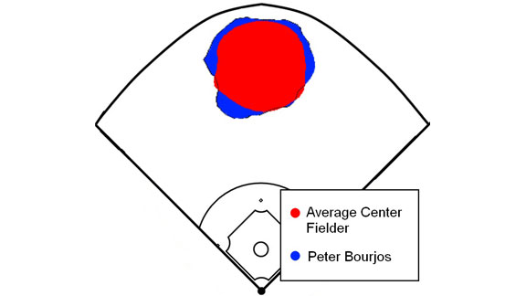
I get it, he can cover a lot of ground (would like to see where Ellsbury compares). What is not conveyed in this is the scale of the drawing. Center field in Fenway is a lot different than lets say center field in Wrigley. I assume this is scaled to averages, but I think they should have put the measurements in. It would have helped for the consumer to figure out how much more Bourjous can cover. (Fangraphs has that!).
And as I thought, Jacoby is 2nd behind this guy, 3 back in the OOZ but he has had 31 more chances. (see.. )
Anyway, nice try.
Social BI
This is something that we are looking to implement in the not to distant future (and probably with Cognos as the platform no less), so it was interesting to read this. Big Blue as a leader in this social movement is kind of hard to believe, but it is nice to see, especially when it seems that many organizations only see Facebook, Twitter and blogs a time sinks and never lead to anything.
Social BI - Business Insider
 However, true to form, something in this picture is far too familiar. Yes, a doughnut is still just a pie without a middle. Notice the layout as well, still has a little bit of the Outlook feel to it as well.
My question is, how do you get at this data? As the article explains, in order for IBM to use the data from its employees, they have to opt IN (as opposed to the old OPT OUT, which is always deep, deep in the TOS). Given the amount of data people now are willing to share, this type of analysis will only be more and more prevalent, but look for the reactionary forces of the privacy advocates to be all over this.
Social BI - Business Insider
However, true to form, something in this picture is far too familiar. Yes, a doughnut is still just a pie without a middle. Notice the layout as well, still has a little bit of the Outlook feel to it as well. My question is, how do you get at this data? As the article explains, in order for IBM to use the data from its employees, they have to opt IN (as opposed to the old OPT OUT, which is always deep, deep in the TOS). Given the amount of data people now are willing to share, this type of analysis will only be more and more prevalent, but look for the reactionary forces of the privacy advocates to be all over this.
Baseball and BI, like Milk and Cookies
I love baseball. I love all sports, but there is something about the depth of the statistics in baseball that get me going. Take a look at the following excellent visualization, it is simple, but really gives a lot of data in a very concise way. If only I could get my customers to get into something like this. I do not know about most of you, but many of my end users would just prefer a dump of the data and then they sift through it themselves. It is maddening.
I rate it Draw Dropping as well
Yes, it is 20 minutes long, but as far as data visualization, it is the best 20 minutes I have ever spent on this topic. Hans knows his stuff. The way he presents is one thing, the way that the animated bubble chart presents is another. I have been struggling to find a product that can do this type of stuff. Think about it, the amount of data behind this is not insane, probably pretty simple, but if you were to see it in "report" form (i.e. another spreadsheet) it would not have the same impact as the viz does. I am not the only one that points to this presentation at TED as what turned me onto trying to make data better, and to be honest we are all better off for having seen it.
BTW, TED talks are always a good way to spend your lunch (so get off of Farmville for a couple of minutes a day and learn something new).
BTW, TED talks are always a good way to spend your lunch (so get off of Farmville for a couple of minutes a day and learn something new).
ERP with baked in BI
Not too sure what to think of this:
ECi M1 ERP
I get it. Users want one stop shopping for everything, and the marriage of ERP to BI is pretty much a given these days (SAP, Oracle anyone?) ECi seems to be a player in the medium sized manufacturing markets so they would have a keen insight into what their customers need and what they need to measure so it may work. However, this is on their website as an example of the GUI
 As you will find out over time, I cannot stand Pie Charts, and this is a prime example of why. What exactly doe the chart on the bottom right tell me other than yellow is slightly bigger than the rest of the slices, beyond that, nothing.
I like bar charts and this one is pretty good, but I am thinking that they could have saved some real estate by not having the actual data displayed below it. They are also very smart in that they have a similar layout to Windows Outlook, which would make the product more likely to be picked up by most users (familiarity is you friend when it come to application design)
Again, I generally do NOT like my BI to be tied to a specific system, but in this case, with the very specific vertical that ECi is targeting, I am ok with it. Just kill the pies please?
ECi M1 ERP
I get it. Users want one stop shopping for everything, and the marriage of ERP to BI is pretty much a given these days (SAP, Oracle anyone?) ECi seems to be a player in the medium sized manufacturing markets so they would have a keen insight into what their customers need and what they need to measure so it may work. However, this is on their website as an example of the GUI
I like bar charts and this one is pretty good, but I am thinking that they could have saved some real estate by not having the actual data displayed below it. They are also very smart in that they have a similar layout to Windows Outlook, which would make the product more likely to be picked up by most users (familiarity is you friend when it come to application design)
Again, I generally do NOT like my BI to be tied to a specific system, but in this case, with the very specific vertical that ECi is targeting, I am ok with it. Just kill the pies please?
Open Source and Big Data go together like..
Pentaho and Big Data
 I remember when Pentaho first came onto the scene. I was excited that something like this would even exist in a space where the big players seem to dominate. They have not gotten the same traction that I though they would be able to, but they have been able to innovate. I think what is holding them back is that the big enterprises out there would be very hesitant to put their data in their hands when they can just use a product from one of the big guys, whom they probably already have in house.
Anyway, they are jumping on the BIG DATA bandwagon. I am still trying to get my hands around what exactly if BIG DATA (other than 2 words that are capitalized). NoSQL really intrigues me, since I deal with an insane amount of data everyday that people seem to want to see in every way possible. What do you think, can Pentaho compete with the big guys, or are they just hoping that they get bought by one of the big guys?
I remember when Pentaho first came onto the scene. I was excited that something like this would even exist in a space where the big players seem to dominate. They have not gotten the same traction that I though they would be able to, but they have been able to innovate. I think what is holding them back is that the big enterprises out there would be very hesitant to put their data in their hands when they can just use a product from one of the big guys, whom they probably already have in house.Anyway, they are jumping on the BIG DATA bandwagon. I am still trying to get my hands around what exactly if BIG DATA (other than 2 words that are capitalized). NoSQL really intrigues me, since I deal with an insane amount of data everyday that people seem to want to see in every way possible. What do you think, can Pentaho compete with the big guys, or are they just hoping that they get bought by one of the big guys?
Hello World..
What is this going to be about? Well, I have been working in the BI space for the past 10 years. It is amazing how much has happened in the industry. Everyday there are new start ups getting into this space. Everyday someone else is buying someone in this space (I contend that the consolidation into BI has led to the big players being complacent with what they have and has stymied the evolution of the products out there). So, what am I going to do with this blog? Cover as much as I can. I will post stuff that I find day to day on the web, from releases from the big players, to some of the best practices that are so important in this area, to some opinion on what works and what does not. Also expect to see some cool baseball, sabre-metric related visualizations since I think some of them are some of the best use of BI that are readily available. This is a conversation, there are many opinions out there, and mine is most definitely not always right. However, where I know I am right... PIE CHARTS MUST DIE.
Subscribe to:
Comments (Atom)