Showing posts with label Pretty. Show all posts

Wednesday, August 17, 2011

Time series comparison

Baseball again..

Lee v Holiday 

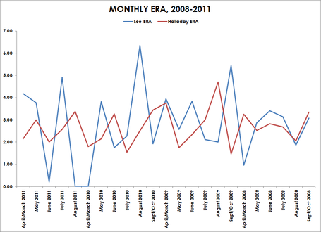
Stephen Few would be proud.  Excellent time series comparison over 2 very good pitchers, but who is the best consistently?  Seems to be Roy in this case, which really does not surprise me, since he dominated the Red Sox for so long in Toronto (but at least those games were pretty short).  The question is who do you want to go in a game 7, some one who is consistent, or someone who, when hot, it better than everyone (Verlander needs to get out of D-Town).

However, I would have like to seen something that compares year over year to see if there is some sort of trend as the season goes along.  Seems to me as well that in 2008 they were essentially the same pitcher.


Tuesday, August 16, 2011

Where do people come from?

People Movin

A pretty slick way to show where the emigrants are coming from (and the inverse as well).  Very, very nice. 

Monday, August 15, 2011

Now this is more like it


The Growth of US Newspapers, 1690-2011 from Geoff McGhee on Vimeo.


Really cool visualization that shows the power of seeing something over time while maintaining a simple UI.  (similar to what Hans Rosling did.. which I talked a little bit about here).  Simple data, powerful presentation.  This was done with public domain data, and was put together by some people at Stanford (go Cardinal, life without Harbaugh starts soon)

Baseball and BI, like Milk and Cookies

I love baseball.  I love all sports, but there is something about the depth of the statistics in baseball that get me going.  Take a look at the following excellent visualization, it is simple, but really gives a lot of data in a very concise way.  If only I could get my customers to get into something like this.  I do not know about most of you, but many of my end users would just prefer a dump of the data and then they sift through it themselves.  It is maddening.